New Look 360 Smith Continues Making an Impression

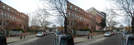
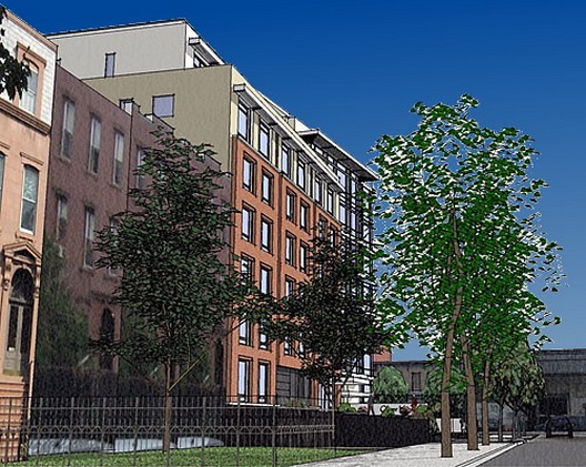
The redesign of 360 Smith Street unveiled last week at a Carroll Gardens Neighborhood Association meeting by the developer, Billy Stein, continues to elicit reaction from residents. The CORD group, which was formed after original renderings or the Robert Scarano-designed "Heavy Metal" building were posted last May, offered up a photoshopped view of Second Place as it might look with the new building as well as a rendering that included blue sky in order to make the building stand out more. Of the view from Second Place, CORD writes on its blog: "It is clear how large the mass is from the surrounding architecture...second place and smith street are dwarfed by this bulk."

Labels: Architecture, Carroll Gardens, Smith Street

5 Comments:
Slice off the top to match the adjoining buildings. A compromise.
You can't just slice off the top. That's no compromise. Billy stein paid for those air rights and he has a legal right to use them. Personally, this rendering to me proves that the new version of this building will fit into the neighborhood pretty well. My gut reaction was "oh, well that's actually not so bad". So much better than the heavy metal building.
Shut up. Move back to Toronto.
Are you blowing Billy Stein?
those are not air rights...
check the facts before you say that
12:16
Post a Comment
<< Home